Tazza
Warmth
Overview
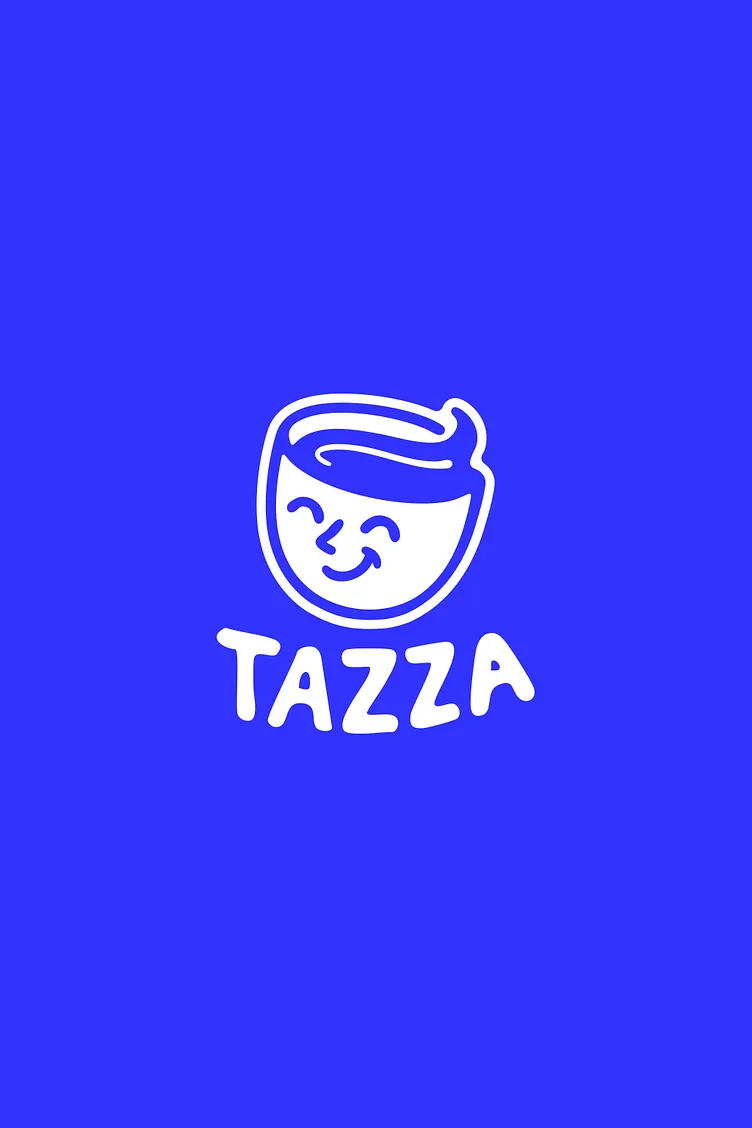
Tazza represents more than coffee — it’s a lifestyle rooted in comfort, joy, and creative energy. Built around a minimalist yet expressive design language, the brand identity captures the beauty of simplicity and the charm of everyday rituals. From the soft color palette to its custom illustration system, every detail of Tazza’s visual world was designed to feel familiar yet refreshingly new. I led the entire creative process, from naming and brand strategy to packaging and art direction, ensuring Tazza stands as an instantly recognizable brand that sparks warmth and connection.
Client:
Tazza
Year:
2024
Category:
Brand Identity
/
Packaging & Art Direction
Location:
Italy

The Challenge
To create a coffee brand that breaks away from traditional, overly rustic aesthetics and embraces a more contemporary, lifestyle-oriented tone — while still retaining warmth, comfort, and a sense of belonging. The goal was to build a brand that resonates with modern coffee drinkers who crave both authenticity and style.
The Solution
We developed a clean and flexible brand identity centered on simplicity and emotion. The logo design embraces fluid lines and geometric harmony, while the color palette blends warm neutrals with soft accent tones. The packaging system — featuring cans, cups, and coffee bags — uses playful illustrations to inject character and charm. This approach made Tazza approachable yet refined, perfectly balancing everyday
comfort with modern sophistication.



The Result
Tazza’s launch positioned it as a refreshing voice in the contemporary coffee space. The brand identity not only enhanced recognition but also invited customers into an experience — a daily ritual that feels uplifting, joyful, and effortlessly modern.
Client feedback
The brand feels alive — every detail from the logo to the packaging reflects the warmth and creativity we envisioned. It’s simple, it’s human, and it captures the exact spirit we wanted Tazza to embody.

Luca Romano
,
Founder & Creative Director, Tazza