Tradebox
Trend
Overview
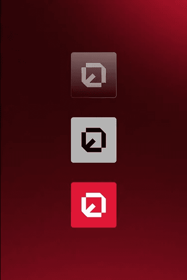
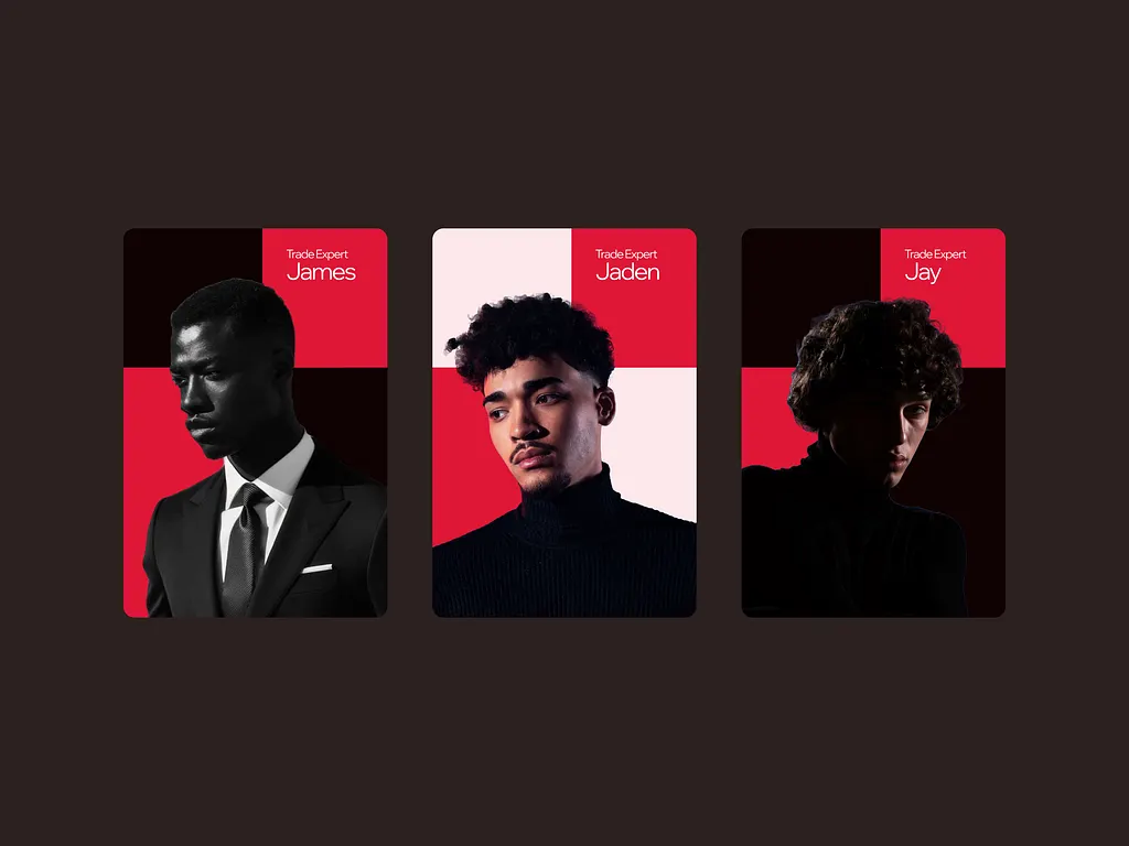
The Tradebox rebrand focuses on redefining how trading firms present themselves in the digital age. We built a bold, high-contrast identity system that communicates trust, motion, and analytical clarity. The logo design captures upward movement — symbolizing growth and momentum — while the visual language employs structured grids, minimal typography, and a powerful color palette of navy, steel gray, and vibrant blue accents. Each design element was crafted to speak the language of finance: dynamic, data-driven, and dependable.
Client:
Tradebox
Year:
2023
Category:
Brand Identity
/
Logo Design & Corporate Branding
Location:
Los Angeles, CA
The Challenge
The Solution
Motion-Based Symbol: Developed a rising box motif to symbolize steady growth and trading momentum.
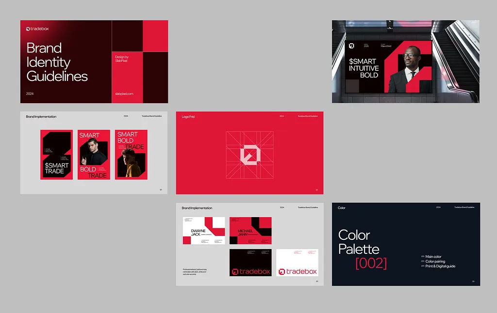
Color Strategy: Combined navy blue (trust) with electric blue (innovation) for a balanced yet energetic identity.
Grid System: Implemented a geometric structure to reflect order, precision, and data logic.
Consistency Toolkit: Created brand guidelines to ensure uniformity across all Tradebox touchpoints.

The Result
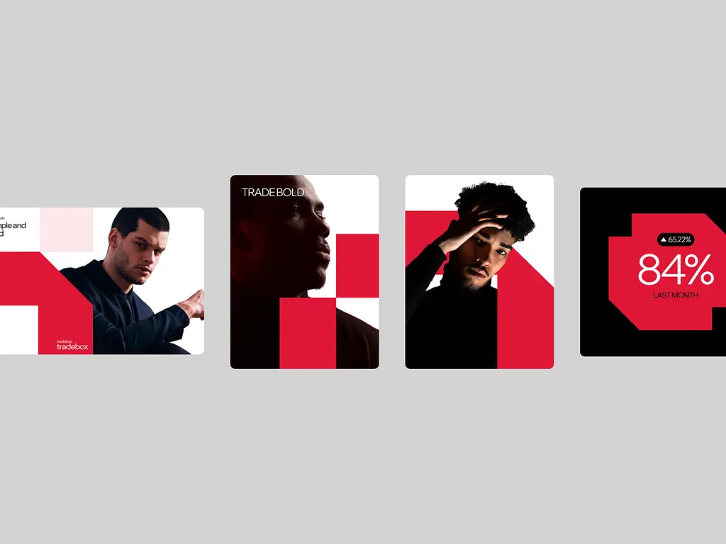
Tradebox saw a lift in both online sales and retail placement. The new brand now communicates both trust and style.
Client feedback
The Tradebox identity redefines how we’re seen in the market — it feels bold, structured, and built for the future of trading.

Serena Liu
,
Creative Director, Tradebox